
Modals are really common in any user interface. It can be used for alerts, to render additional information or provide a way to enter data.
In this tutorial, we will learn about the Gutenberg Component Modal and see what options does it provides to us.
If you’re interested in reading the source code of this component, head to the repository.
A great thing about this component is that you can call it anywhere in your application, but the Modal will still load in the parent node of the DOM, so it won’t be affected by any CSS rules such as overflow:hidden and such.
This is done because this component uses the createPortal()
The Gutenberg component Modal is built using:
- IsolatedEventContainer – prevents certain events from propagating outside of the container; accepts ModalFrame,
- ModalFrame – accepts ModalHeader and all children elements,
- ModalHeader – shows the modal header with a close button.
Modal Properties
There are several properties which you can pass to the Modal component:
- title – used in
modal header, onRequestClose – a function that is called when the modal should be closed,contentLabel – Optional. Added to the modal content elementas aria-label, - aria – JavaScript object.
labelledby – Optional. Addedas aria-labelledbyto the modal content element.Default is modal-heading, describedby – Optional. Addedas aria-describedbyto the modal content element.
- focusOnMount – Optional. If true, it will focus on the first element in the modal. Default
is true, - shouldCloseOnEsc – Optional. If true, the modal will close when the escape key is pressed. Default
is true, - shouldCloseOnClickOutside – Optional. If true, the modal will close when a mouse
clicks occurs outside of the modal. Defaultis true, isDismissable – Optional. If false, the modal will not be dismissable and will not show the close icon. Defaultis true, - className – Optional. If added, this class will be added to the modal content element,
- role – Optional. This is the HTML
attribute role. Defaultis dialog, - overlayClassName – Optional. If added, this class will be added to the modal overlay element.
Modal Example
Here is the example provided in the Gutenberg documentation for the Component Modal.
This example uses withStateModal
How Gutenberg uses the Modal Component
Let’s now see how Gutenberg uses it’s own Modal component.
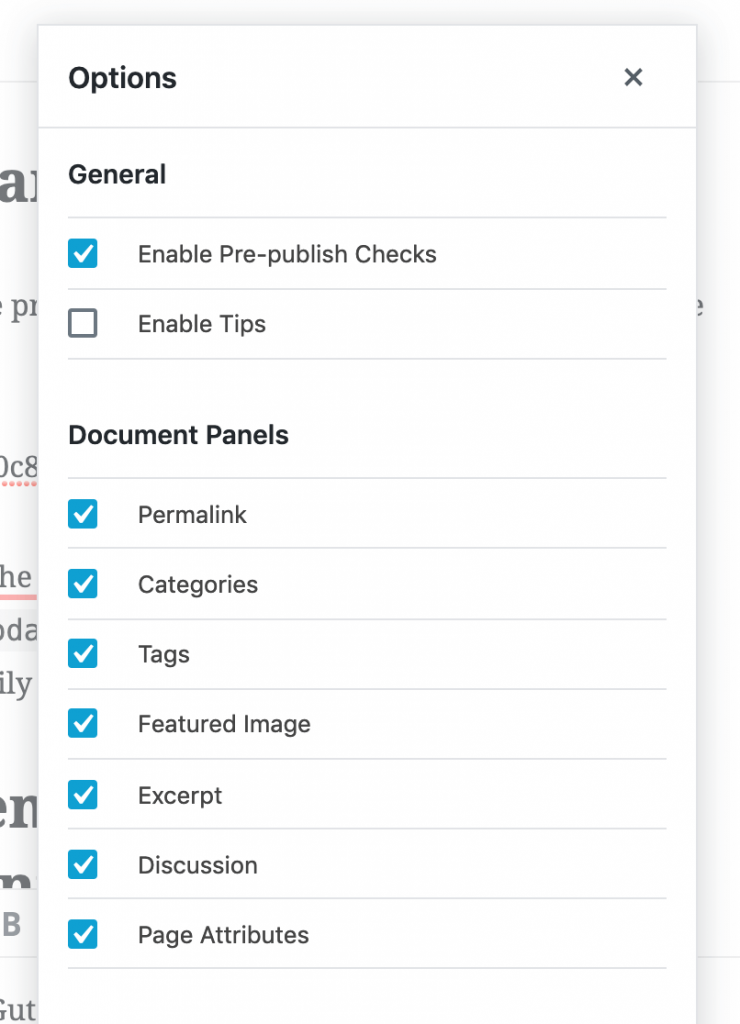
When using the Gutenberg, you can see the Modal component being used for post options. You can browse the code of that option modal in the repository.
Here is a small part of the code used in the Options Modal component.
This function accepts an object with parameters:
- isModalActive – if true, it will show the modal,
- closeModal – a function that will close the modal.
Using the Modal in a Separate React Application
I will now show you how you can import this component into a separate React (or any other JS) Application. We’ll use the example above so we need only to install the dependencies and also to define the CSS (SASS).
This will not be a fully working modal since you’ll have to integrate it into your app and define some of the SASS mixins, but I’ll give you enough information that you’ll be able to implement it in a few minutes.
This part is available only to the members. If you want to become a member and support my work go to this link and subscribe: Become a Member
Conclusion
The Gutenberg Component Modal is a really nice component to enhance your App’s UI and provide some additional way to manage data or show information.
By using that component in your app, you have a straight forward way of implementing a modal without too much hassle.
Have you tried using the Modal component in some of your blocks? Let’s us know about your challenges or what you’ve built with it in the comments below.
Become a Sponsor


Share this: